Web design - Richardson Conservatories

Some of our latest sites.
If you want to talk to us about designing your website, please call, fill out
our contact form or email us. Our website designs start from just £380.


What we did
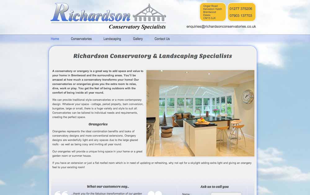
This established landscape company was looking to expand into selling conservatories. They wanted a site that looked friendly and not cold or too corporate. They wanted to attract people to get in touch without being put off by thinking that they might be a large, very expensive company to deal with.
We achieved this with an airy, bright feel as well as utilising the latest state-of-the-art coding techniques to render a non-standard font for all the headings. The site also includes a gallery for the company's recent work.


